Digitala Lagkassan, a Swedish brand, underwent a complete transformation to establish a new brand identity and enhance their user interface. Their goal was to simplify the lives of teams and organizations with their digital accounting service, providing a streamlined solution for financial management. Through this rebranding effort, they aimed to position themselves as a leading provider of convenient and efficient digital accounting services in Sweden.
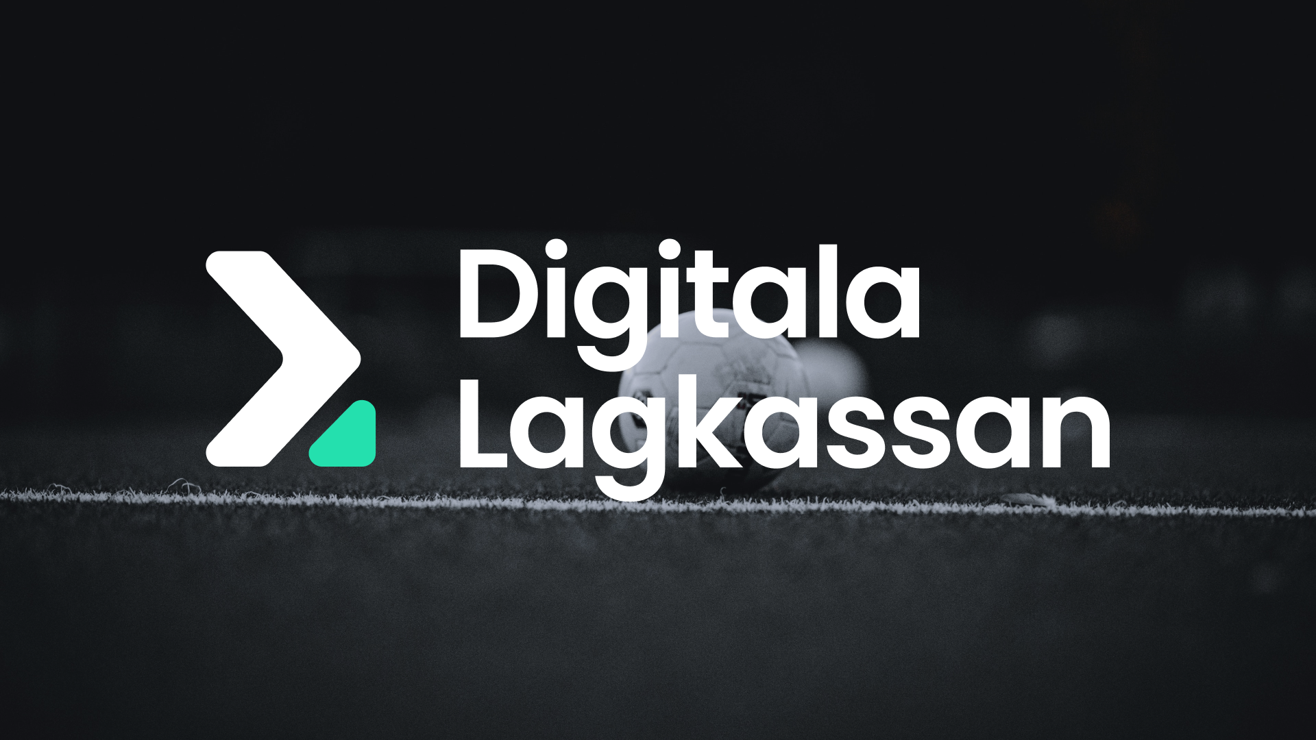
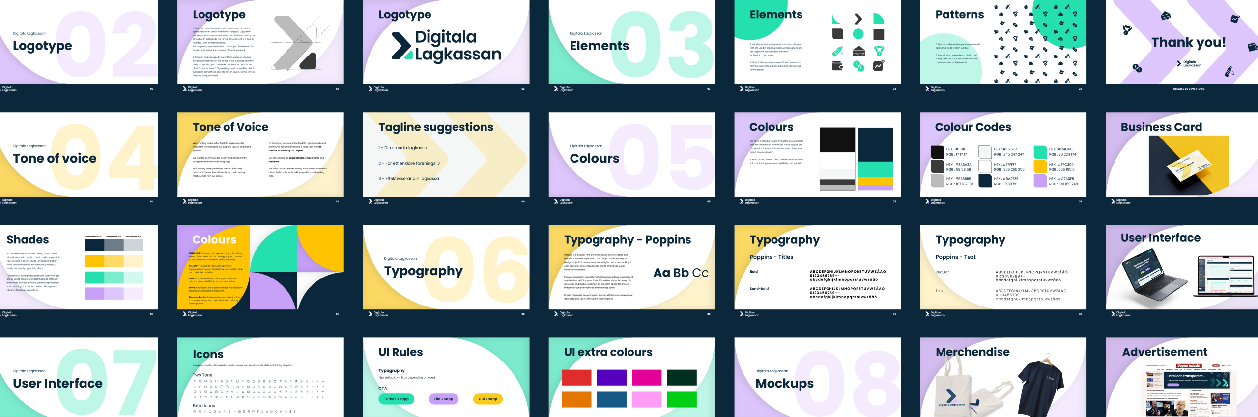
Logotype
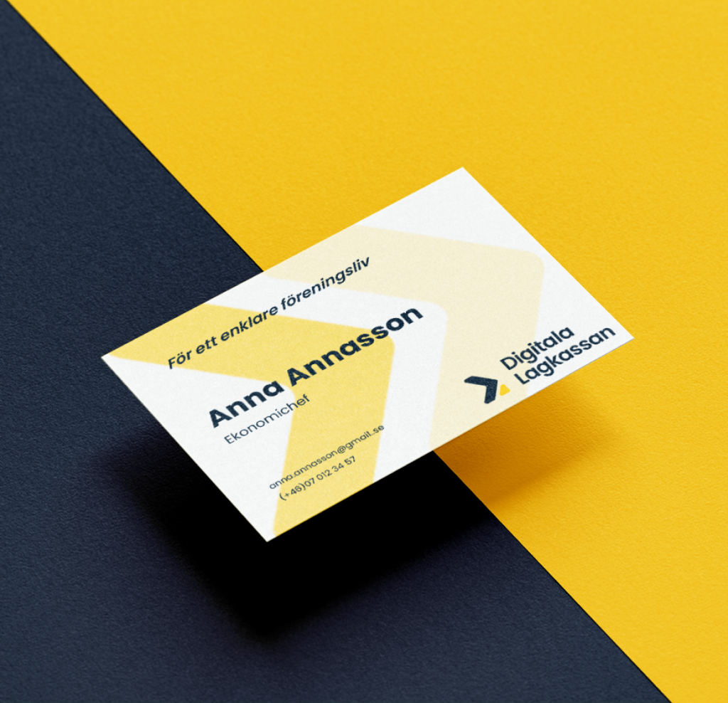
Designing the logo for Digitala Lagkassan proved to be quite challenging. With their lengthy name and lack of a previous graphic profile, we aimed to create something entirely new and refreshing. After careful consideration, we ultimately settled on an arrow as our final design. This symbol not only embodies progress and forward motion in sports but also has the versatility to represent various sports equipment, such as a hockey stick or a person in motion.
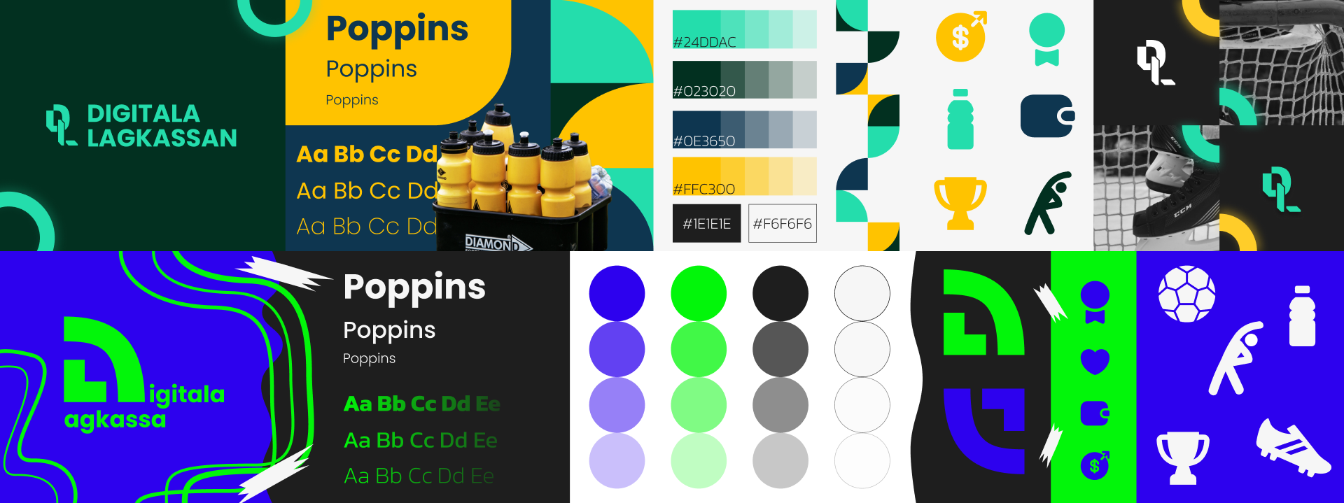
Colours
In order to distinguish the brand identity from others, we opted to modify the original colors that had a straightforward sports theme. The new color scheme is better suited to the target audience and encompasses a wider range of purposes, creating a more soothing contrast.
Ideation
To kick off the project, we created a stylescape, akin to a moodboard, to showcase the potential direction for the new branding. This allowed the client to have a say in the design they wanted us to pursue, fostering a collaborative understanding of each other’s ideas. Although the stylescape served as an initial inspiration, the final result differed from it. Nonetheless, the client expressed great satisfaction and excitement upon their initial viewing of the stylescape, setting a positive tone for the project.